The report is the home of the tool. It gathers every signal for one area and one period into a single page. Here is what each part is for, in the order you meet it.
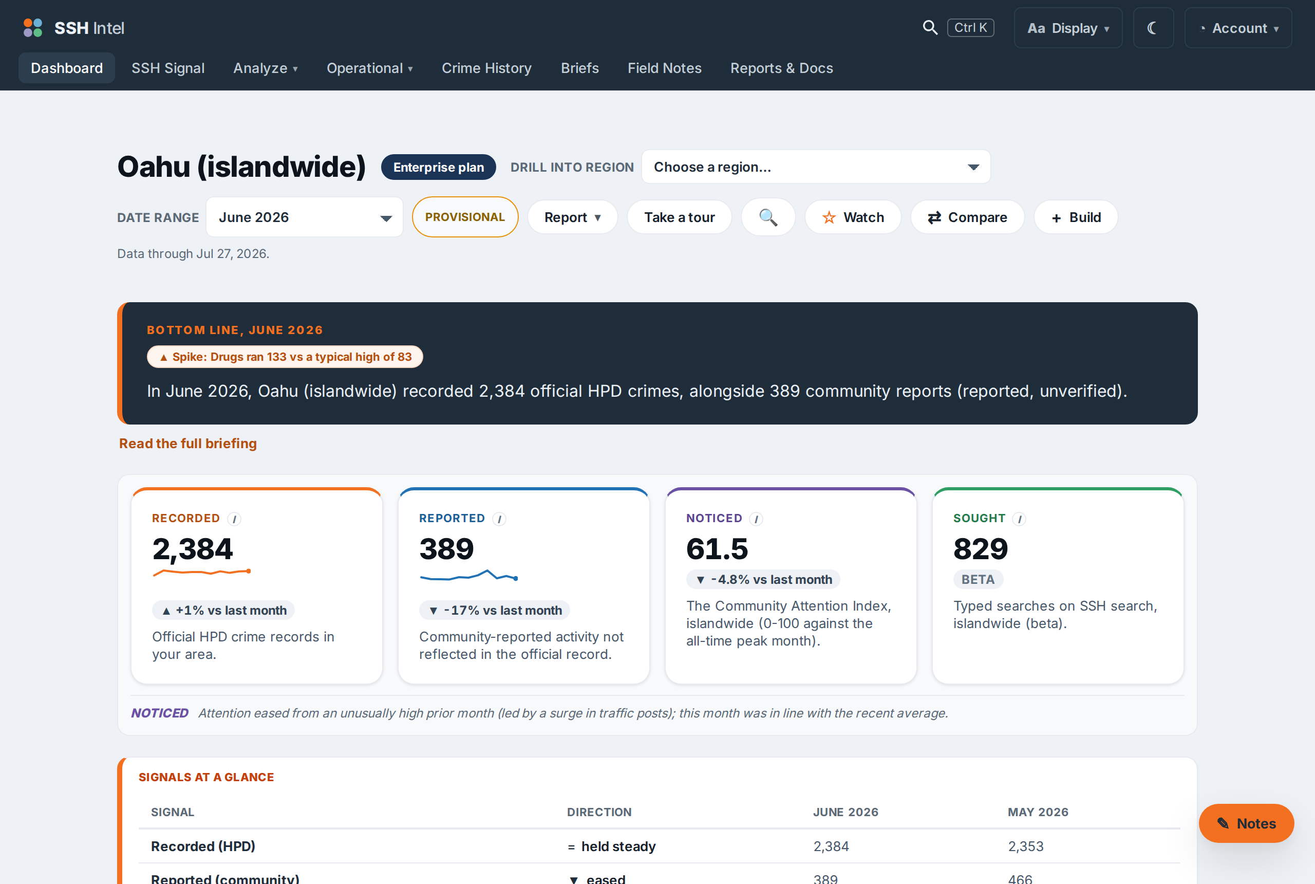
The area picker and date range
At the top you choose the area (within what your plan covers) and the date range. The report always opens on the most recent complete month. A Provisional tag means the latest month is still settling and will firm up. "Data through" tells you the freshest date behind the page.
The bottom line
The dark banner is a written briefing generated from the numbers: the headline counts plus anything that stands out. It is the fastest way to understand the month. "Read the full briefing" expands it into the full Field Notes briefing for the period.
The four signal cards
Recorded, Reported, Noticed, and Sought, each with a count, a sparkline, and a versus-last-month change. These are the four instruments. They sit side by side and are never summed.
Rates, trends, and the map
Below the cards, the report breaks each signal down by category and over time, shows per-capita rates with confidence bands, and maps the area. The map offers six views of the same record: the classic ZIP layers (Recorded, Reported, Noticed), a fine equal-area grain, census-tract rates on a daytime-population basis, each ZIP's overnight share, what moved against the prior window, and where community attention agreed or diverged from the official record. Expand opens it full screen with scroll-to-zoom and drag-to-pan; Focus narrows the recorded layer to one offense group; dashed rings mark your registered properties, and clicking a ring shows the half-mile figures around that property.
Gray always means withheld, never zero data hidden from you: a faint warm tint marks areas holding 1 to 4 records (the exact count is withheld below 5), plain gray means none, muted color means the rate's confidence band is wide, and clicking any withheld area explains what can be said: whether anything was recorded, the all-months figure when it clears the threshold, and the surrounding ZIP's number. For what the rates and bands mean, see Reading the numbers.
Building a shareable version
Report and Build (top of the page) let you open a full, print-ready version and, on plans that include it, download a PDF. The PDF carries the same numbers as the screen, by design.
Last updated 2026-07-15 HST